Data Visualization
When we have thousands of sampled numerical data, it makes no sence
without classifying them and analyzing them. Many Statistical tools are
available to classify the data in Python. pandas is one such
library. After classifying the data, it is useful to visualize the
classified data. Visualization can result in greater understanding of
Data, such as Corelation and so on. matplotlib is one of the famous,
easy-to-use library for data visualization
Standard Import statement
In matplotlib, we won’t use entire library. We just use a part of
library which is dedicated for plotting data. In further discussions
related about matplotlib, we assume that the reader has imported the
library in following manner
In [1]:
import matplotlib.pyplot as plt
Our First Graph - A Parabola
 is the equation of standard parabola. We sample some
 values and calculate the square of them. Then we plot a graph
of
values and calculate the square of them. Then we plot a graph
of  versus to obtain the parabola
In [2]:
import numpy as np
In [3]:
x = np.arange(50)  # 0..19
y = x**2
In [4]:
plt.plot(x,y) # First argument is x data, second data is y data
# plt.show() , If in Python Script
Out[4]:
[<matplotlib.lines.Line2D at 0x7fda54f14ba8>]

Note
If not using a Interactive Notebook or IPython shell, then issue a
plt.show()
to see the plot
Also see how matplotlib converted set of points to represent a
parabola by interpolation
Customizing the Graph - Changing its type and color
When representing various data in graph, different style must be used to
distinguish between the data sets. In this section, we will see how to
manipulate the line style and color. Following are the named arguments
that are sent to plot() functions.
linestyle = value
can be used to change line style.
We shall see the inbuilt lineStyles dict to see what are the
possible styles for value
{'-': '_draw_solid', '--': '_draw_dashed', '-.': '_draw_dash_dot', ':': '_draw_dotted', 'None': '_draw_nothing', ' ': '_draw_nothing', '': '_draw_nothing'}
color = value
can be used to change color of line. value can be one of
- b: blue
- g: green
- r: red
- c: cyan
- m: magenta
- y: yellow
- k: black
- w: white
alpha = value
 - value determines the visibility of plot. It is a
floating point number between 0 and 1.
- value determines the visibility of plot. It is a
floating point number between 0 and 1.  implies that
the plot is not visible.
implies that
the plot is not visible.  implies that the plot is
completely visible
implies that the plot is
completely visible
Plotting multiple graphs on same axis
Many times, it is required to plot many datasets on same axis, so that
we can compare them. MatPlotLib makes it possibe in a simple way. One
can achieve this by issuing plotting commands successively and finally
issuing a show().
An All-in-One example
Let’s examine all these things by plotting
 and
and
 in a single plot. Instead of using
 np.arange()
for data, We shall use the np.linspace() method
np.linspace(start, stop, num=50)
Return evenly spaced numbers over a specified interval.
Returns num evenly spaced samples, calculated over the interval
[start, stop].
The endpoint of the interval can optionally be excluded.
Parameters:
start : scalar: The starting value of the sequence.stop : scalar: The end value of the sequence, unless endpoint is set to False. In that case, the sequence consists of all but the last of num + 1 evenly spaced samples, so that stop is excluded. Note that the step size changes when endpoint is False.num : int, optional : Number of samples to generate. Default is 50. Must be non-negative. endpoint : bool, optional
Returns:
samples : ndarray: There are num equally spaced samples in the closed interval [start, stop] or the half-open interval [start, stop) (depending on whether endpoint is True or False).
In [5]:
f1 = lambda x: 1/x
f2 = lambda x: np.sin(x)
f3 = lambda x: np.cos(2 * x)
f4 = lambda x: 2 * np.sin(2 * x)
x = np.linspace(-4 * np.pi, 4 * np.pi , 200)
p1 = plt.plot(x,f1(x), color = 'r', alpha = 0.5)
plt.plot(x,f2(x), color = 'g', alpha = 0.8)
plt.plot(x,f3(x), color = 'b', alpha = 0.6)
plt.plot(x,f4(x), color = 'y', alpha = 0.6)
# plt.show() # If using in Python Script
Out[5]:
[<matplotlib.lines.Line2D at 0x7fda54bc49b0>]

Subplots
In many cases, we want the opposite of what we have just discussed. We want to plot the data sets in different subplots. MatplotLib has many ways to obtain the subplots of given plot. Here we will just discuss one of them.
plt.subplot(nrows,ncols,active)
creates the subplots with shape 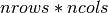 , and selects a
subplot for plotting specified on
, and selects a
subplot for plotting specified on active. active is a 1
based index for selecting subplot. It selects subplots in row-wise
order.
Adding Title
Adding title to subplot can be achieved via
plt.title('label')
Adding title to Super plot can be achieved by
plt.suptitle('label')
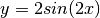
An example
In the below example, Let’s see all of the things discussed in action
In [6]:
functions = [ lambda x: 1/x, lambda x: np.sin(x), lambda x: np.cos(2 * x), lambda x: 2 * np.sin(2 * x) ]
lables = [r'$y = \frac{1}{x}$' , '$y = sin(x)$', '$y = cos(2x)$', '$y = 2 sin(2x)$' ]
x = np.linspace(-4 * np.pi, 4 * np.pi , 200)
plt.suptitle('Some curves in $xy$ plane')


for i,(function,label) in enumerate(zip(functions,lables),start = 1):
    # zip() combines 2 iterables as list of tuples
    # enumerate() enumerated the zip here
    # enumerate returns an iterator through (count,value) tuples
    # but value is iteself is a tuple of (funciton,label) here
    # So we have to catch a tuple (count,(function,lablel))
    plt.subplot(2,2,i)
    plt.plot(x, function(x))
    plt.title(label)

plt.tight_layout(h_pad=3) # Exclude this and see what happens
# plt.show() # if using in script

Plotting irregular data - Scatter and Bar Plots
Some data shows irregular pattern, due to which they can’t be
interpolated. When plotting such data, MatplotLib behaves crazily. In
this situation, we have to use some other plotting method other than
plot(). Before exploring other methods, Let’s see a situation where
ordinary plotting doesn’t work.
In [7]:
arr = np.linspace(-10,10)
x = np.copy(arr) # If you use x = arr, their reference will be copied
np.random.shuffle(arr)
plt.plot(x,arr)
# plt.show() # if using in Python Script
Out[7]:
[<matplotlib.lines.Line2D at 0x7fda540f7eb8>]

Above image does not seem to be like a plot of some Polynomial or Other function. In fact, We will not treat them as plot of some function. They are just data.
To visualize this kind of data, Scatter and Bar plots can be used
Scatter Plot
Scatter plot only plots the sample points, instead of interpolation and
drawing lines between them. It takes the same arguments as that of
plot(). Let’s see one
In [8]:
plt.scatter(x, arr, color='b',alpha = 0.6)
Out[8]:
<matplotlib.collections.PathCollection at 0x7fda540dec50>

Note how we changed the color and alpha of plot.
Bar Plot
Bar plot visualizes the data as bars, whose height is proportional to the magnitude of data. Let’s plot the same data as bar chart and understand it’s customization.
In [9]:
plt.bar(x, arr, alpha = 0.6, edgecolor='k')
Out[9]:
<Container object of 50 artists>

Note how rectangle edges are visible with black color. Overlapping
rectangles are also visible with 
Visualizing 2D Data - Matrix
A matrix can be interpreted as values of a function  where
where
 and
and  are indices of matrix. Now
  can be
visualized as a surface over
can be
visualized as a surface over  . This requires switching
to 3D co-ordinates. Instead of doing that, one can visualize the same in
2D plane by mapping the each value to a colormap. In MatplotLib, we can
do this by
. This requires switching
to 3D co-ordinates. Instead of doing that, one can visualize the same in
2D plane by mapping the each value to a colormap. In MatplotLib, we can
do this by imshow() and matshow()
In [10]:
data = np.arange(100)
np.random.shuffle(data)
data.shape = (10,10)
plt.matshow(data)
Out[10]:
<matplotlib.image.AxesImage at 0x7fda54bfa400>

To know what color means what value, one can enable the colorbar
In [11]:
plt.matshow(data)
plt.colorbar()
Out[11]:
<matplotlib.colorbar.Colorbar at 0x7fda54b9ddd8>

Let’s experiment with some large data
In [12]:
n = 1000
data = np.arange(n**2)
np.random.shuffle(data)
data.shape = (n,n)
plt.matshow(data)
plt.colorbar()
Out[12]:
<matplotlib.colorbar.Colorbar at 0x7fda4efbf828>

It looks like above plot is like a random image. In fact, images are
also matrices. Different file formats like jpeg,png and
tiff store the matrix and associated data in different ways.
Consider an image with resolution 1900 * 1600
- Its data is a matrix with shape
(1900 , 1600) - If it is a color image, Each element of matrix is either a value, 3-tuple or 4-tuple based on it’s color scheme
- If image is monochromatic, each element of matrix is value. 0 representing white, 255 representing black
- If color scheme of image is RGB, each element of matrix is
(Red,Green,Black)tuple with each element ranging from 0 to 256 - If color scheme of image is CMYK, each element of matrix is
(Cyan,Magenta,Yellow,blacK)tuple with each element ranging from 0 to 256
Since image is a matrix, any operation on matrix is a operation on image. It is the basis of how Photo Editing Softwares work. It is also the fundamental of a field of Computer Science known as Image Processing
Going Further
In this tutorial, we have seen just the fundamentals of Data
Visualizations using matplotlib. There are many more kinds of plots,
one can even animate the plots. Interested reader can refer Official
Tutorial